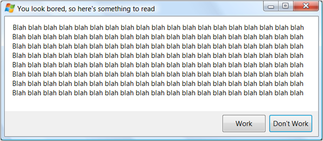
I love this image:

I know this is true because in my role as friends-and-family help desk, I get people to read the error messages and then I repeat whatever they just told me and then they are like "oh, I get it! Thanks! I'm glad I know someone who understands these darn computers!" This works over the phone when I can't even see the message.
Now why am I mentioning this, besides the fact I love this dialog? Because it comes from a lovely blog entry by Chris Jackson on why app compat problems can't be fixed by talking to the user about them. You slave over a lovely dialog with a button which might as well say CLICK HERE TO GET A VERSION THAT DOESN'T HAVE THIS PROBLEM or a checkbox that might as well say CHECK THIS IF YOU DON'T THINK ITS A PROBLEM AND ARE SICK OF BEING REMINDED but instead the user clicks JUST THIS ONCE I WANT TO USE THE OLD ONE BUT BE SURE TO TELL ME ALL THIS AGAIN NEXT TIME.
Is there a solution? I don't know. But you need to know people are like this.
Kate