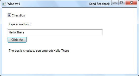
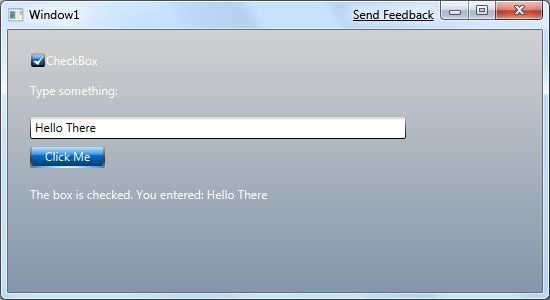
Inspired by the side by side approach of the "eye candy" article I linked to, here are two apps to compare:


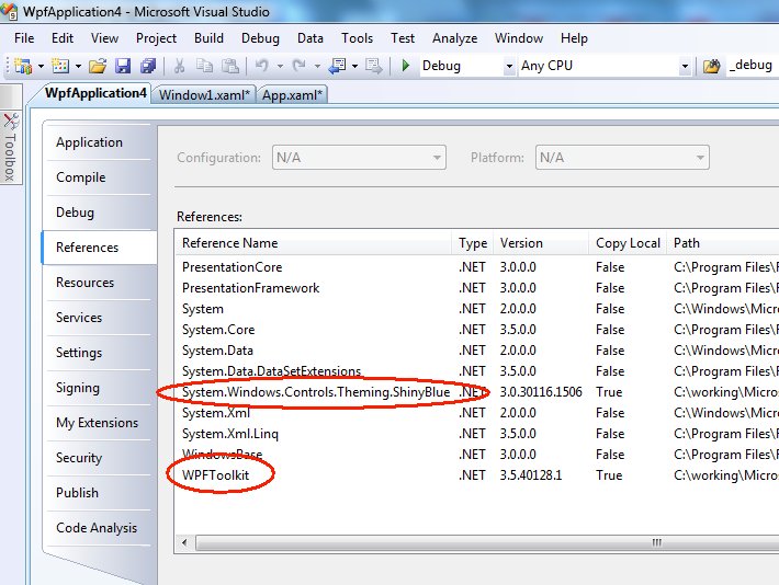
Yes, they're the same app. The difference is a theme - one of the ones I posted about a while ago. I had to make four changes to this application to get this theme applied. I started by copying the appropriate XAML and DLL files (in this case, ShinyBlue.xaml and System.Windows.Controls.Theming.ShinyBlue.dll) into the project folder. Then I added the XAML into the project, and added references to the dll and also to WpfToolkit:

This lets me use dynamic resources from the theme. This particular theme doesn't have a default background brush, so I edited the XAML for my window to use the background brush in the theme:

For everything except the background (the colour of the button, the checkbox, the foreground text colour for the label and so on), it's just a matter of adding the ResourceDictionary in App1.XAML:

The various controls look good together - that's the work of the theme. This is a pretty simple way to make a dramatic difference in your application. If you didn't look at WPF themes yet, you really should.
Kate