Ok, perhaps it's not news that a keynote is fundamentally different from a breakout. But many keynotes look just like breakouts - the way the slides are written, for example - and many keynotes leave a lot of attendees unsatisfied. A meme began to rise among presenters that "bullets are bad" and "bullets can kill you". I agree completely for keynotes. I don't agree for breakouts, and I've been to breakouts with the pictures of kittens and the single emotionally loaded word and then a picture of a tree and just hated them. But the a-ha! for me is the simple statement: a keynote is not a breakout.
It just makes the whole anti-bullet / pro-bullet thing click for me. The keynote can be full of pictures and super simple words, because it's a keynote. The breakout can still have slides with bullets, tables, charts etc because it's a breakout. Of course the deck for a keynote is not of value without the presenter. It's a keynote. This works for me. Major credit to me "getting" this goes to (of course) Garr Reynolds of Presentation Zen. His post on how dramatically
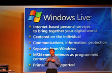
Bill Gates has changed his keynote style - slides, posture, tone, and more -- really lit a light bulb in my head about keynotes and breakouts, whether that was the intention or not. The post itself is highly informative and if you ever speak in from of an audience, you should read it and look at the pictures. These two are from 2005 and 2010 and I think they show you quite a difference:


So, a keynote is a not a breakout (something Bill clearly gets now) and a breakout is a not a keynote. Meaning the kitten content of my talks isn't likely to increase until someone invites me to keynote for them

.
Kate