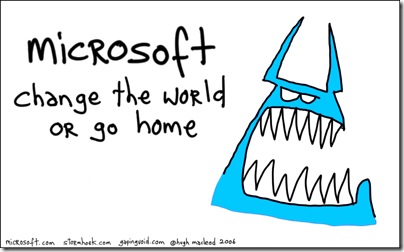


All three from Steve Clayton's blog which I admire tremendously. The monster (Blue Monster updated to Azure Monster)matches the logo to my eye and they're both lighter and greener than the hex from the shirt. Btw I pronounce Azure with the emphasis on the first syllable 
Kate
ps: No clue what Azure is yet and wish someone would post about that instead of colours and pronounciations? Try http://blogs.zdnet.com/microsoft/?p=1671 for Mary Jo's take.