 Tuesday, 29 September 2009
I read (in the blog of one of his people) that Bill Wagner has won yet another award. This one is from Automation Alley, an organization that represents technology firms in southern Michigan. He was honoured in the Emerging Leader of the Year category. According to their nomination form, the award "recognizes an individual with a strong commitment to the future growth and success of Southeast Michigan’s technology community." They expect a Director or VP who has "numerous accomplishments to technology company, industry and/or market", shows "proven leadership" and is "active and respected in technology community". Yep, sounds like Bill to me! One of the delights of being an RD is that it brings people like Bill into my work life. Congratulations! Kate
 Sunday, 27 September 2009
Funny thing happened when I was reading Steve Clayton's blog. He had a Nike ad embedded - something he does quite often when he finds something funny or well done. And it was good, but about halfway through I realized something... I was recognizing the background. At about the 10 second mark there's some stairs down to SHOPPING CONCOURSE, and then this cluster of newspaper boxes, and then a mailbox, a "blue bin" for recycling,
  > >
And then after more
newspaper boxes, street signs, and street furniture, this unmistakable
silhouette reflected in a mirrored building: 
It didn't just look familiar because all cities look the same. It looked familiar because it was Toronto. I've played the ad a bunch of times now and am having fun spotting the bike racks, specific stretches of sidewalk and buildings, and so on. The final shots are the the "spare subway station" (Lower Bay) whose only purpose these days is for movie and TV shoots, and the occasional special event. An enjoyable ad even if you don't live in the GTA, but a rewind-and-pause-a-thon if you do. Thanks Steve!
Kate
 Friday, 25 September 2009
Scott Ambler says a lot of "detailed specifications" are just "detailed speculations". You think people might need some particular feature, so you write some very detailed material that says "you could click this button to confirm it" and "there could be this grid that would show you all the pending requests" and so on, and that also says "we think that if we code everything the way we've just said, it will take X hours/days/weeks of effort over Y elapsed days/weeks/months/years." And tempting as it is to say that all this is some sort of binding contract signed in blood, the truth is we're all guessing. Guessing what users might need, guessing what might be a good way to give them that (both in terms of what it looks like and in terms of how it would be coded), and guessing how hard or easy it would turn out to be. We're speculating. And the users, they're speculating too, about how they would use that feature and how important it is to them. It's an interesting thought.
Don't get me wrong. We write specs. We also guess what things will cost. But we don't write the kind of super-detailed, prototype-heavy, let's-list-every-field-on-the-report stuff until that last responsible moment. Do you? Kate
 Wednesday, 23 September 2009
I read something that surprised me at first - you can get more battery life by choosing your browser carefully. Then I had a sort of "sober second thought" and realized that of course it matters what software you use. The more CPU you use, the more battery you use. It's compounded if you start to get hot from using all that CPU and the fan speeds up, or if you're giving the hard drive a workout too. But armwaving and "maybe" and "might" can only go so far. How about some measuring? 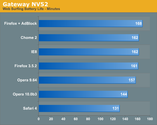
That's pretty convincing. Read the article for the technical details. Kate ps: I have adblocking functionality through a carefully tailored hosts file, so my IE8-and-home-grown-adblock probably means I am maximizing my battery life, at least while surfing. Not sure Visual Studio and SQL Server are particularly battery friendly 
 Monday, 21 September 2009
It's not a very well known fact that the Zune plays games. Because of the large screen, it's actually quite a pleasant experience. The selection is not exactly vast, though. 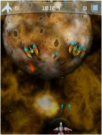 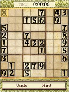 The story is going to get more interesting now that the HD is released. Business Week has an article suggesting the Zune could be "a gaming titan", believe it or not. And then I read a report about an iPhone app being ported to the Zune in just 12 hours. Wow! Of course, just because they've ported it to the Zune doesn't mean you can have it - the marketplace story is Microsoft only at the moment. But I think we're in interesting times... Kate
 Saturday, 19 September 2009
Jeff Barnes has published a wonderful array of material to his Sky Drive: 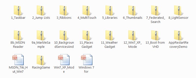
You can read his description and get the link on his blog. If you have the Windows 7 training kit, you may recognize a lot of this, but if you're just starting to think about developing for Windows 7, this is one way to get started. For others, try my Client Development category. Kate
 Thursday, 17 September 2009
Recently, I read an inspiring document. It included these quotes: - “Everything is best for something and worst for something else. The trick is knowing for what, when, for whom, and why.” —Bill Buxton
- “Perfection is achieved, not when there is nothing more to add, but when there is nothing left to take away.” —Antoine de Saint-Exupery
- “The ability to simplify means to eliminate the unnecessary so that the necessary may speak.” —Hans Hofmann
- “Simple things should be simple. Complex things should be possible.”—Alan Kay
- “Everything should be made as simple as possible, but not simpler.”—Albert Einstein
- “I have only made this letter longer because I have not the time to make it shorter.”—Blaise Pascal
I especially like the Einstein one, which I've used in works of my own. But what's surprising about these quotes is the document where I found them. It's 828 pages long and most of those 828 pages is more like this: - To achieve coolness, start not by thinking about what the technology can do, but by focusing on what your target users really need. Before adding that “cool” feature, make sure there are clear user scenarios that support it.
- When asking a question, use labels that match the question. For example, provide Yes and No responses to a yes or no question.
- Don’t give error messages when users aren’t likely to perform an action or change their behavior as the result of the message. If there is no action users can take, or if the problem isn’t significant, suppress the error message.
Can you guess? It's user interface guidelines. Specifically, the Windows User Experience Interaction Guidelines, brought to my attention by Qixing Zheng, a User Experience Advisor with Microsoft Canada, and available on MSDN as a tree of web pages or for download as a single PDF. And man, are they good! The philosophy behind them really resonates with me. The document starts out very generally, then drills in a bit, then drills in a bit more, then explodes into hundreds of pages of incredible detail about just the right way to use a button or a link or radio boxes or whatever. Here are the headings in a 19-item list that I just love: - Nail the basics
- Design experiences, not features
- Be great at something
- Don’t be all things to all people
- Make the hard decisions
- Make the experience like a friendly conversation
- Do the right thing by default
- Make it just work
- Ask questions carefully
- Make it a pleasure to use
- Make it a pleasure to see
- Make it responsive
- Keep it simple
- Avoid bad experiences
- Design for common problems
- Don’t be annoying
- Reduce effort, knowledge, and thought
- Follow the guidelines
- Test your UI
In the real document, there's a paragraph or so for each of these that flesh it out just a little. But as you read the whole hundreds and hundreds of pages you will see how these 19 concepts are really informing all of it. And I love the courage to stop at 19, a prime number, instead of trying to come up with another one to get a round 20. I'm only quoting the philosophy stuff here but man, there are plenty of technical details like how far apart to space controls, how to design a good ribbon, choosing your button text, working with pen, touch, keyboard shortcuts, and the mouse, when to use menus and toolbars, when your application should take focus, how long tips should hang around before fading away again, and on and on and on. Read it, live it, pass it around. See if you can't use some of the philosphy and design guidance in your web apps too. Kate
 Tuesday, 15 September 2009
WPF applications are beautiful. Using WPF themes and controls helps to make that possible. So control vendors make apps that show off their controls - it's a smart thing to do. And here's one that you can use every day - that I will be using every day - and it's free. Take a look: 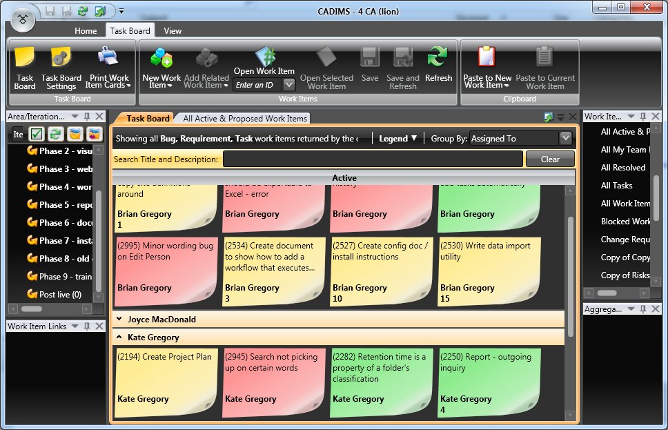 This is a snapshot of the Task Board view for a real project I have underway at the moment. Green are requirements, yellow are tasks, and red are bugs. (Why is Create Project Plan still Active on a project that is well underway? Because it's a living document and I check in changes to it against that work item through the life of the project. We're not talking about a .mpp file here.) The views are wildly customizable, of course, but this is a nice one. There are plenty of others. I especially like the Search box at the top. I think we all have fake queries we use for searching, but this is so much neater. It's a client application (so's Visual Studio, of course) that runs on your machine and connects to your TFS server. You can add/edit and generally play with work items here (including dragging and dropping them from the Active side of a view to the Resolved one to resolve them) and interact with the repository. It's prettier than Visual Studio, faster than Visual Studio, and probably a whole lot more acceptable to the managers, project managers, and QA reviewing types in your life than Visual Studio. The one I showed it to sure liked it. Download your copy today! Kate
© Copyright 2024 Kate Gregory
Theme design by Bryan Bell
newtelligence dasBlog 2.3.9074.18820   | Page rendered at Thursday, 21 November 2024 07:16:16 (Eastern Standard Time, UTC-05:00)
|
On this page....
Pluralsight Free Trial
Search
Navigation
Categories
Blogroll
Sign In
|